Here’s a question from Emilio:
I loaded an Excel spreadsheet to my Power BI desktop app, and inserted a stacked chart visual. When looking at the x axis i see that the chart month axes (X) is sorted our in a wrong order – in my case alphabetically – which doesn’t make much sense. How can i arrange the axis labels in a chronological descending order. Any pointers here.
Order Power BI chart axis chronologically
To sort your Power BI visual x-axis by month name, follow the steps outlined in this tutorial:
- In Power BI Desktop, hit the Insert button and then go ahead and pick the New Visual option.
- Next, drag the required fields into the visual. In this example we will analyze the Course Revenues by calendar month, so we will drag the Month into the X Axis and Sum of Order Amount into the Y Axis of our visual.
- Note: You can alternatively create a stacked chart by inserting more fields into your bar chart legend.
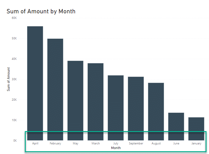
- As you can see, our column chart is ordered by the Order amount – however in descending order.
- Luckily we can fix this issue very easily: hover with your mouse over the upper right side of our visual and you will find the More Options button (3-dots).
- Hit the More Options button and select Sort Axis.
- The select your Date field (in our case Month).
- Now, your months will be sorted in descending order which is not too helpful.
- Hit again on More Options but now pick the Sort in Ascending Order option.
- Your column chart should look as following:

Power BI chart not ordered according to day of the week
In our next example, we will look into sorting the Y axes in a stacked or cluster bar chart.
Assume that you have this visual showing sales amount by day of the week:

As can be observed the day of weeks are not order chronologically; for example: Sunday is the last day in the y axis.
Adding a day week column
The trick here is to sort our Day of Week column according to other column, which we will call Day of the Week Number.
- In the right hand side Data pane, highlight your table.
- Open the Data View.
- From the Ribbon, hit the New Column Button.
- Enter the following DAX formula and hit Enter:
Day of Week Number = WEEKDAY(Courses[Open Date])You’ll see that a new column containing the week day number was created:

Ordering by day of the week chronologically
- Now go back to the Report View.
- In your Data tab highlight your y-axis field (in our case Day of Week).
- From the Ribbon hit the Sort by Column button.
- Pick the Day of Week Number field.
- Your chart y-axis is chronologically arranged:

Case Study # 2: Sort chart axis values by another column
Import Dataset to Power BI
We will first go ahead and import the following data into our Power BI report. Note the column header names as we will use them throughout the tutorial.

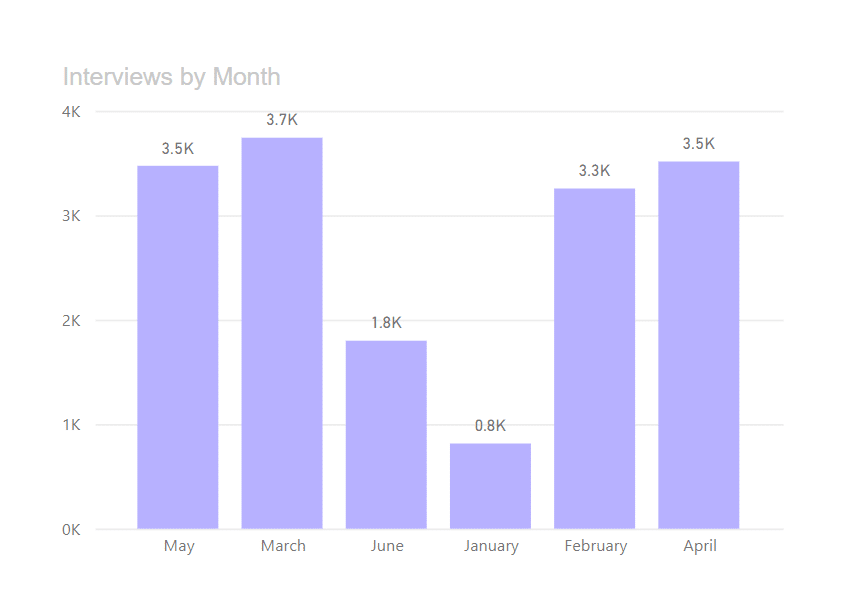
As you can see for each date we have a Month name column, as well as a random number of interviews executed as part of this candidate campaign.
Rendering our bar plot visual
We can render a simple bar chart using the data above. Here’s the result:
Create an hidden Month Number column
As you can see, the month names are randomly ordered and can’t be sorted according to the chronological order.
Therefore, we will now proceed and create a Month number column:
- Open the Data View.
- Hit the New Column button.
- Use the following DAX expression to create the column:
Month Number = Month (Interviews[Date])- Hit Enter – you will see that the Month Number column was populated with the relevant values.
- Go the Data Pane in the right.
- Right click the Month Number column and select Hide in report view.
- Hit Save.
Sort your chart by hidden column
- Return to the Report view.
- In the Data tab, highlighted the Month Name.
- Then under the Column Tools tab hit the Sort by Other column button.
- From the Dropdown, select Month Number.
- Now look into your bar plot – if the X- axis is not ordered correctly, hover on the top right side of the visual and hit the More Options ellipsis (three dots).
- Select the Sort Axis option and pick Sort Ascending.
- You will be now all set:

Alternative Approaches for Date-Based Sorting
For more complex date scenarios, you can use additional DAX functions to create custom sort orders. The DATEVALUE() function works well when dealing with text-based date formats, while EOMONTH() can help sort by month-end dates for financial reporting periods.
When working with fiscal years that don’t align with calendar years, create a custom fiscal month number column using:
Fiscal Month = IF(MONTH([Date]) >= 7, MONTH([Date]) - 6, MONTH([Date]) + 6)Working across multiple platforms
The sorting methodology differs slightly between Power BI Desktop and Power BI Service. In Power BI Service, some sorting options may be limited compared to Desktop, particularly when working with custom columns created via DAX. Always test your reports in both environments if you’re planning to publish to the cloud.
For users working with Power BI Mobile, be aware that complex multi-level sorting may not display identically on smaller screens. Consider creating simplified mobile-optimized versions of your reports with clearer axis labels.