Microsoft 365 Copilot chart creation for business insights
“I have tons of sales data in Excel, but I’m struggling to create meaningful charts that actually tell a story to my stakeholders. Can Microsoft Copilot help me transform this raw data into professional visualizations without spending hours formatting and adjusting charts manually?”
This scenario reflects a common challenge many business professionals face when working with data visualization. While you have valuable information at your fingertips, creating compelling charts and dashboards often requires significant time and design expertise that takes away from analyzing the actual insights.
Microsoft Copilot companion chart solution and workflow overview
Creating effective data visualizations traditionally involves multiple manual steps, from selecting the right chart type to formatting colors and labels. Microsoft 365 Copilot revolutionizes this process by using artificial intelligence to understand your data context and automatically generate appropriate visualizations based on your natural language requests.
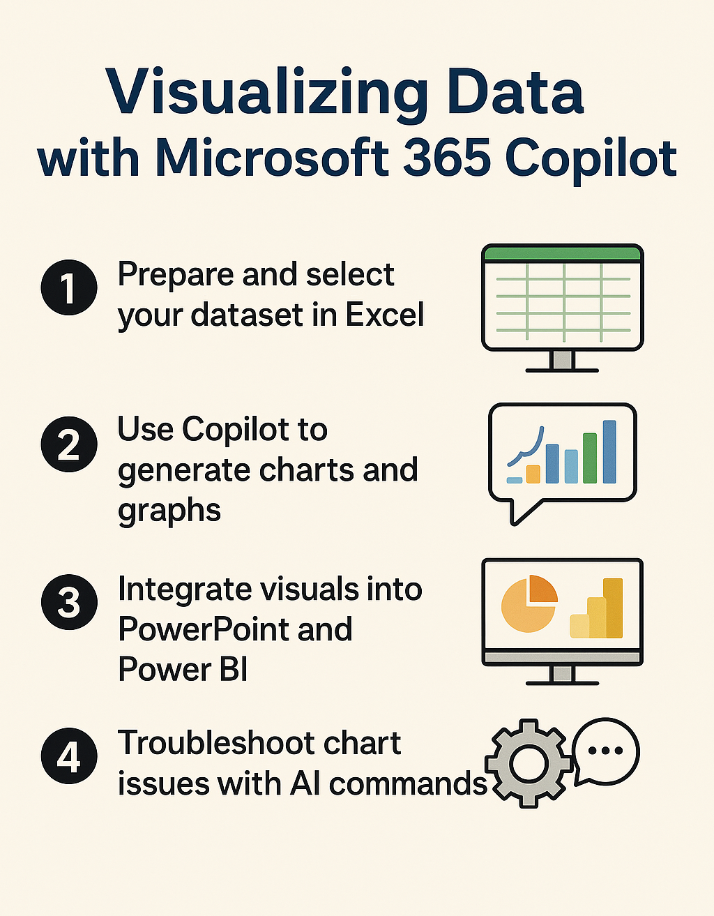
We will use Copilot’s AI-powered visualization capabilities across Excel, Power BI, and Teams to transform raw data into professional charts and interactive dashboards. You’ll learn to use conversational prompts to generate graphs, customize visualizations, and create comprehensive reporting solutions that communicate your data story effectively.
Before starting, ensure you have Microsoft 365 Copilot access enabled in your tenant, along with appropriate licenses for Excel, Power BI Pro, and Teams. You’ll also need sample data in Excel format and basic familiarity with navigating Microsoft 365 applications to follow along with the implementation steps.
Can Copilot generate graphs using Excel integration?
Excel serves as the primary platform for Copilot’s data visualization capabilities, offering the most comprehensive set of charting features through AI assistance.
- Open Excel and load your dataset, ensuring your data includes clear column headers and is formatted as a proper table by selecting your data range and pressing Ctrl+T to convert it into a structured table format.
- Click the Copilot button in the ribbon or press Alt+H+FX to activate the Copilot panel, then type a natural language prompt like “Create a bar chart showing sales by region” or “Generate a line graph of monthly revenue trends.”
- Review the suggested chart that Copilot generates automatically, which will appear as a preview with options to insert it directly into your worksheet or modify the visualization type based on your specific requirements.
- Customize your visualization by asking Copilot to make specific adjustments such as “Change the colors to match our brand palette” or “Add data labels to show exact values on each bar.”
- Insert multiple charts for comprehensive analysis by requesting different visualization types for the same dataset, such as “Also create a pie chart showing the percentage breakdown of sales by product category.”
Expert Tip: When working with large datasets, ask Copilot to filter or summarize your data first before creating visualizations to ensure your charts remain readable and focused on key insights.
Microsoft Copilot dashboard preview creation process
- Combine multiple charts into a dashboard layout by asking Copilot to “Create a summary dashboard with our top three performance metrics” which will generate a coordinated set of visualizations on a single worksheet.
- Format your dashboard for presentation by requesting Copilot to “Apply professional formatting with consistent colors and spacing” which automatically adjusts chart sizes, alignment, and visual hierarchy for better readability.
- Add interactive elements to your dashboard by asking Copilot to insert slicers or filters that allow users to dynamically change the data view, such as “Add a date range selector to filter all charts by month.”
- Export your completed dashboard by using Copilot’s assistance to “Prepare this dashboard for PowerPoint presentation” which will optimize chart sizes and formatting for external sharing and reporting purposes.
Microsoft Copilot and Power BI integration for advanced analytics
Power BI extends Copilot’s visualization capabilities beyond basic charts into sophisticated business intelligence dashboards with real-time data connections and advanced analytics features.
- Launch Power BI Desktop and connect to your data source, then activate Copilot by clicking the Copilot icon in the ribbon to begin creating visualizations through natural language commands rather than manual drag-and-drop operations.
- Generate complex visualizations by describing your analytical needs, such as “Create a geographic map showing sales distribution across regions with bubble sizes representing revenue amounts” which Copilot will interpret and build automatically.
- Build interactive reports by asking Copilot to “Add cross-filtering between charts so clicking on one visual updates all others” creating a cohesive analytical experience for end users exploring the data.
- Implement advanced calculations by requesting Copilot to “Calculate year-over-year growth percentages and display them in a waterfall chart” which automatically creates the necessary DAX measures and appropriate visualization types.
Power BI Copilot visualization optimization techniques
- Enhance report performance by asking Copilot to “Optimize this report for mobile viewing” which automatically adjusts visual sizes, layouts, and interaction methods for smartphone and tablet consumption.
- Create automated insights by instructing Copilot to “Analyze this data and suggest three key findings” which uses AI to identify trends, outliers, and correlations that might not be immediately obvious from manual examination.
- Implement governance and security by requesting Copilot to “Apply row-level security based on user roles” ensuring that different stakeholders see only the data relevant to their organizational responsibilities and access levels.
- Schedule and distribute reports by asking Copilot to “Set up automatic email delivery of this dashboard to the sales team every Monday morning” streamlining your reporting workflow and ensuring stakeholders receive timely updates.
Copilot AI chart creation in Microsoft Teams collaboration
Teams integration allows you to create and share visualizations directly within your collaborative workspace, making data insights immediately accessible to your team members during meetings and discussions.
- Access Copilot within Teams by opening a chat or channel, then typing @Copilot followed by your visualization request such as “Create a chart from the budget data we discussed in yesterday’s meeting.”
- Upload data files directly to Teams and ask Copilot to “Analyze the attached Excel file and create three different charts showing our key performance indicators” which processes your data and generates multiple visualization options.
- Share interactive charts in meetings by requesting Copilot to “Create a presentation-ready chart that shows our project timeline and milestones” which can be displayed and discussed in real-time during Teams calls.
- Collaborate on data analysis by asking team members to contribute questions, then use Copilot to “Generate visualizations that answer all the questions raised in this conversation” creating a comprehensive analytical response to group inquiries.
Copilot charting troubleshooting and optimization
While Copilot significantly simplifies data visualization, users may encounter common challenges that require specific solutions and workarounds to achieve optimal results.