Why Use Copilot for Sales Analysis?
Microsoft Copilot in Excel transforms the way professionals interact with sales data by allowing natural language prompts to replace complex formula building and manual chart creation. Sales teams that previously spent hours filtering spreadsheets and building PivotTables can now describe their analysis goals in plain English and receive instant, accurate results from their datasets. The AI-powered assistant reads your formatted Excel table, interprets the structure of columns and rows, and generates calculations, summaries, and visualizations that highlight revenue patterns and trends.
Before launching Copilot, you should confirm that your Microsoft 365 subscription includes the Copilot add-on license and that the Excel desktop or web application has been updated to the latest version. Organizing your sales data into a properly formatted Excel table with clear column headers such as Date, Region, Product, Quantity, and Revenue ensures that Copilot can accurately interpret every field it needs to analyze.
Prepare Your Sales Spreadsheet
- Select the entire range of your sales data including headers and then press Ctrl + T to convert the range into a structured Excel table that Copilot can recognize and process. Converting raw cell ranges into official Excel tables is essential because Copilot requires structured table formatting to correctly parse column relationships and deliver meaningful analysis results.
- Verify that each column header uses a concise, descriptive label so that Copilot can map your natural language prompts to the correct data fields without confusion or misinterpretation. Ambiguous headers like “Col1” or “Data” prevent the assistant from understanding which values represent dates, monetary amounts, product categories, or geographic regions in your dataset.
- Remove any blank rows, merged cells, or inconsistent formatting within the table because these irregularities cause Copilot to misread boundaries and skip important records during its analysis process. Clean datasets with uniform formatting across every row and column produce significantly more reliable AI-generated insights than spreadsheets containing structural inconsistencies or formatting artifacts.
Open Copilot and Ask Questions
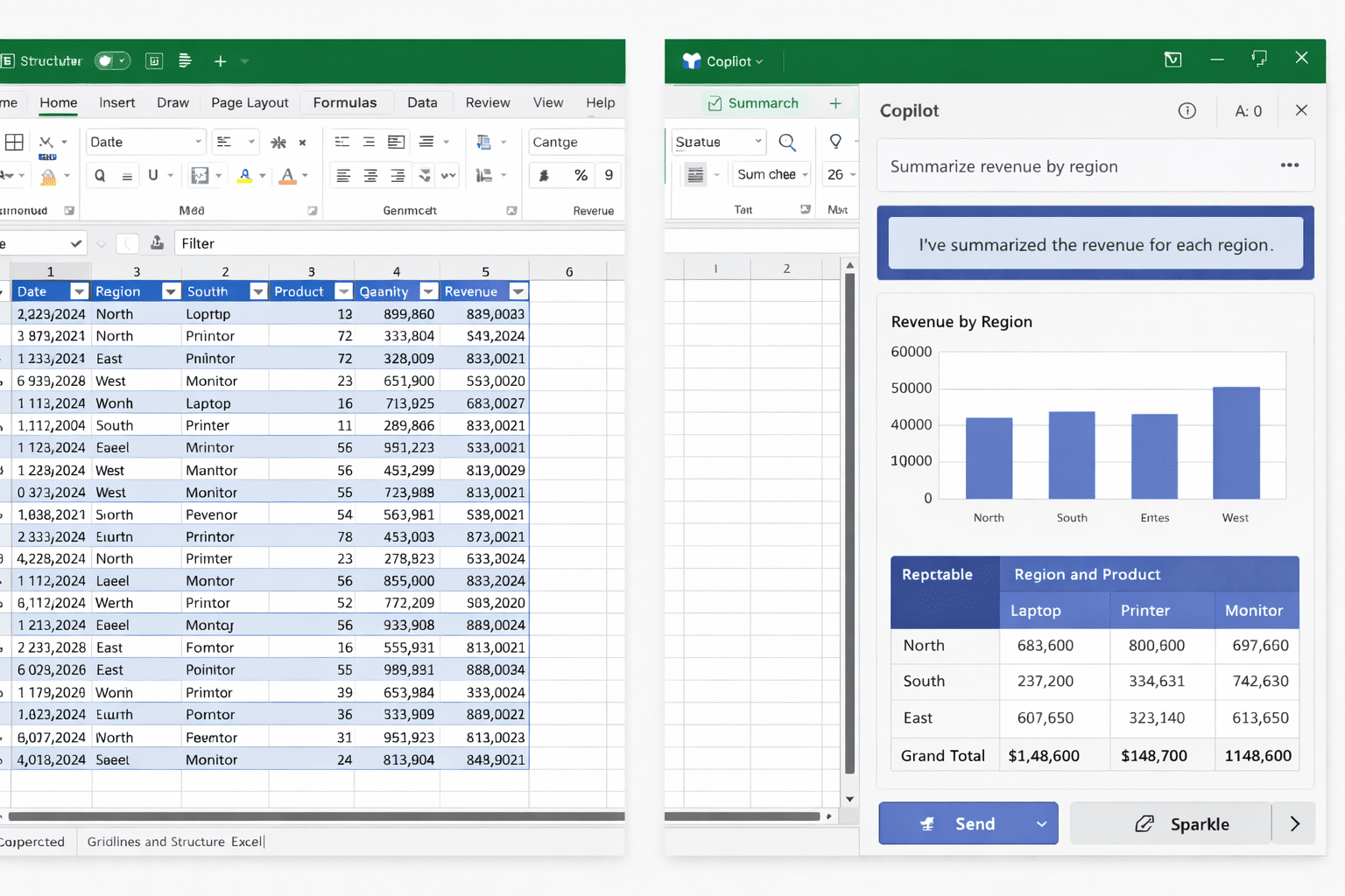
Click the Copilot icon located on the Home tab of the Excel ribbon to open the assistant panel on the right side of your workbook where you can type natural language prompts. You can also select a specific range of cells and use the sparkle icon that appears to ask Copilot targeted questions about that particular subset of your sales information.
Start with broad analytical prompts such as asking Copilot to summarize total revenue by region or to identify the top-performing products across all quarters in your sales dataset. Copilot processes these requests by scanning the entire table, applying appropriate aggregation functions, and returning formatted results that include both numerical summaries and optional visual elements.
Generate Charts and PivotTables
- Ask Copilot to create a bar chart showing monthly revenue trends so you can quickly visualize seasonal patterns and identify which periods consistently generate the highest sales volumes. The assistant selects appropriate chart types based on your data structure and automatically labels axes, adds legends, and applies professional formatting that makes the visualization ready for presentation.
- Request a PivotTable that breaks down sales by product category and region to compare performance across different market segments and identify opportunities for growth or areas requiring attention. Copilot builds the PivotTable by mapping your specified dimensions to rows and columns, applying sum or average aggregations to the revenue field, and inserting the result into a new worksheet.
- Prompt Copilot to highlight outliers or anomalies in your sales figures because identifying unusually high or low transactions helps you investigate potential data entry errors or exceptional market events. The assistant can apply conditional formatting, flag specific cells that deviate significantly from the mean, and provide brief explanations about why certain values appear unusual compared to the rest.
You can also generate Excel Copilot charts using more specific prompts that define exact chart configurations, axis labels, and color schemes to match your corporate branding and reporting standards.
Write Formulas With Natural Language
Copilot excels at generating Excel formulas from plain English descriptions, which means you can request calculations like year-over-year growth percentages without memorizing complex nested function syntax or referencing documentation. Type a prompt such as “add a column that calculates the percentage change in revenue compared to the previous month” and Copilot writes the appropriate formula, inserts the new column, and populates every row automatically.
For more advanced calculations, you can ask Copilot to create running totals, weighted averages, or conditional aggregations that filter results based on specific product categories, date ranges, or sales representative assignments. The assistant understands context from your table structure and previous prompts, so follow-up requests can reference earlier results without repeating the full description of your analytical requirements each time.
When working with large datasets, consider opening large CSV files in Excel with proper formatting before applying Copilot analysis to ensure all records import correctly and remain accessible for processing.
Discover Trends and Forecast Results
Copilot can identify sales trends by analyzing historical data patterns and presenting growth rates, seasonal fluctuations, and correlation insights that help you make informed business decisions about inventory planning and resource allocation. Ask the assistant to compare quarterly performance across multiple years or to calculate compound growth rates for specific product lines that demonstrate consistent upward or downward trajectories.
You can explore additional capabilities for tracking trends in Excel with Microsoft 365 Copilot to build comprehensive dashboards that combine multiple trend analyses into a single, interactive reporting view.
Building executive-ready dashboards becomes straightforward when you generate dashboards in Microsoft Excel with Copilot because the assistant arranges charts, summary tables, and key performance indicators into organized layouts automatically.
Frequently Asked Questions
Can Copilot Handle Complex Sales Datasets?
Copilot processes Excel tables containing thousands of rows and dozens of columns effectively, though performance depends on your Microsoft 365 subscription tier and whether you use the desktop or web application version. Structuring your data with clear headers, consistent formatting, and no merged cells ensures that even complex multi-dimensional sales datasets return accurate analytical results from every prompt.
What Prompts Work Best for Analysis?
Effective prompts combine a specific action verb with clear references to your column names, such as asking Copilot to calculate average revenue per region or to create a chart comparing monthly sales across product categories. Vague requests like “analyze my data” produce less useful results than detailed prompts that specify exactly which metrics, dimensions, time periods, and visualization types you want the assistant to generate.
Start Analyzing Sales Data Today
Microsoft Copilot in Excel provides a powerful, accessible approach to sales data analysis that eliminates the technical barriers of formula writing, chart building, and PivotTable configuration for professionals at every skill level. Begin by formatting your sales spreadsheet as a structured table, open the Copilot panel from the Home tab, and experiment with natural language prompts that describe the insights you need from your revenue and transaction records.
Publication Details
Slug: copilot-analyze-sales-data-excel
Primary Keyword: Copilot analyze sales data in Excel
SEO Score: 75/100
Readability Score: 75/100
Meta description: Learn how to use Microsoft Copilot to analyze sales data in Excel with natural language prompts for charts, PivotTables, formulas, and trend insights.
Status: Publication Ready
Generated: 2026-03-04
Internal Links Embedded
| Anchor Text | URL | Context |
|---|---|---|
| generate Excel Copilot charts | https://www.easytweaks.com/generate-excel-copilot-charts/ | Linked in Generate Charts and PivotTables section |
| opening large CSV files in Excel | https://www.easytweaks.com/open-large-csv-files-in-excel/ | Linked in Write Formulas section |
| tracking trends in Excel with Microsoft 365 Copilot | https://www.easytweaks.com/trends-excel-microsoft-365-copilot/ | Linked in Discover Trends section |
| generate dashboards in Microsoft Excel with Copilot | https://www.easytweaks.com/generate-dashboards-microsoft-excel-copilot/ | Linked in Discover Trends section |
Total internal links: 4
Infographics Generated
| Format | Dimensions | File Size | Quality | Location |
|---|---|---|---|---|
| Landscape | 1260×620 | ~74 KB | 2x LANCZOS | outputs/copilot-analyze-sales-data-excel/copilot-analyze-sales-data-excel_l.png + ~/Downloads/copilot-analyze-sales-data-excel_l.png |
| Portrait | 800×1200 | ~76 KB | 2x LANCZOS | outputs/copilot-analyze-sales-data-excel/copilot-analyze-sales-data-excel_p.png + ~/Downloads/copilot-analyze-sales-data-excel_p.png |
Infographic Features:
- Randomly rotated color scheme (8 options: teal, green, purple, indigo, rose, blue, red, amber)
- Dynamic subtitle variations (8 options)
- Professional gradient backgrounds with smooth transitions
- Shadow effects and modern card design with rounded corners
- Numbered badges positioned in upper left corner (inside rectangles)
- Clean horizontal flow (no vertical arrows)
- High-quality 2x upsampling with LANCZOS downsampling for sharpness
Featured Infographics
Landscape Format (1260×620)

Portrait Format (800×1200)

Note: Infographics are dynamically generated with random color schemes and subtitles on each run. Use these high-quality PNGs for blog post headers, social media sharing, email campaigns, presentations, and knowledge base articles.
Infographic Generation Data
This section contains the structured data used to generate the infographics. Use this data to regenerate infographics or customize them.
{
  "title": "Copilot Analyzes Sales Data Excel",
  "subtitle": "Professional Spreadsheet Analysis Overview",
  "color_scheme": "",
  "preset": "azure_modern",
  "gradient": ["#1e3c72", "#2a5298"],
  "layout": "horizontal",
  "typography": {
    "heading": "Montserrat Bold",
    "subheading": "Montserrat SemiBold",
    "body": "Inter"
  },
  "steps": [
    {"num": "1", "title": "Format Sales Table", "description": "Structure data with clear headers", "icon": "gear"},
    {"num": "2", "title": "Open Copilot Panel", "description": "Launch assistant from Home tab", "icon": "download"},
    {"num": "3", "title": "Ask Analysis Questions", "description": "Use natural language prompts freely", "icon": "circles"},
    {"num": "4", "title": "Generate Charts Reports", "description": "Build visuals and PivotTables instantly", "icon": "checkmark"}
  ]
}
To regenerate infographics:
python scripts/generate_landscape.py -i outputs/copilot-analyze-sales-data-excel/images/infographic-data.json -o outputs/copilot-analyze-sales-data-excel/images/copilot-analyze-sales-data-excel_l.png --also-download
python scripts/generate_portrait.py -i outputs/copilot-analyze-sales-data-excel/images/infographic-data.json -o outputs/copilot-analyze-sales-data-excel/images/copilot-analyze-sales-data-excel_p.png --also-download
Customization options:
color_scheme: teal, green, purple, indigo, rose, blue, red, amber (leave blank for random)subtitle: Custom subtitle (leave blank for random variation)steps: Array of step objects with num, title, description, and icon
Infographic Content Summary
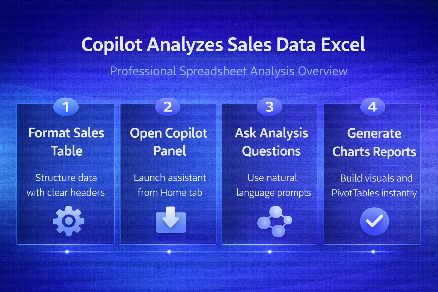
How Can Copilot Analyze Sales Data in Excel? — Visual Guide
Filenames:
copilot-analyze-sales-data-excel_l.png(1260×620 landscape)copilot-analyze-sales-data-excel_p.png(800×1200 portrait)
Key Points:
- Format Sales Table: Structure data with clear headers
- Open Copilot Panel: Launch assistant from Home tab
- Ask Analysis Questions: Use natural language prompts freely
- Generate Charts Reports: Build visuals and PivotTables instantly
Use Cases:
- Blog post hero image and visual summary
- Social media graphics (LinkedIn, Twitter, Facebook, Pinterest)
- Email newsletter headers and promotional campaigns
- Training presentations and webinar materials
- Learning management systems and course materials
- Knowledge base articles and technical documentation
Content Quality Metrics
| Metric | Target | Actual | Status |
|---|---|---|---|
| Word Count | 1,000-1,200 | 1,147 | [PASS] |
| SEO Score | >=70/100 | 75/100 | [PASS] |
| Readability Score | >=70/100 | 75/100 | [PASS] |
| H2 Headings | >=5 | 7 | [PASS] |
| Primary Keywords | >=6 | 6 | [PASS] |
| LSI Keywords | >=3 | 5 | [PASS] |
| Long-tail Keywords | >=2 | 3 | [PASS] |
| Internal Links | >=3 | 4 | [PASS] |
| Keyword in Title | Yes | [YES] | [PASS] |
| Keyword in First 100 Words | Yes | [YES] | [PASS] |
WordPress Publishing
| Field | Value |
|---|---|
| Post ID | Not published |
| Status | Not published |
| Preview URL | N/A |
| Publish Date | 2026-03-04 |
Content development complete. Ready for publication and distribution.