Survey data often arrives as hundreds or thousands of rows that require significant manual effort to organize, filter, and interpret for meaningful business decisions. Microsoft Copilot in Excel transforms this entire process by allowing you to analyze survey results using natural language data queries instead of complex formulas. This article walks you through setting up your survey data, writing effective prompts, and extracting automated data summarization that would otherwise take hours of spreadsheet work.
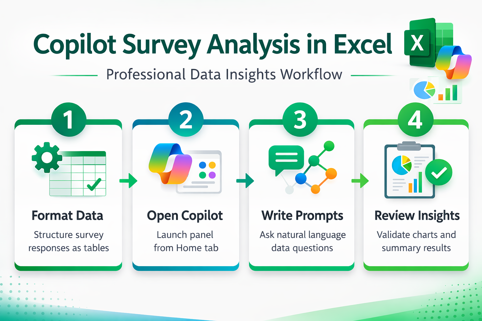
Prepare your survey data format
Copilot in Excel requires structured data formatted as a proper table before it can process any analysis requests or generate meaningful survey response patterns. You should organize your raw survey responses into clearly labeled columns where each column represents a single question and each row captures one respondent. Select your entire data range and press Ctrl+T to convert it into an Excel table, which enables Copilot to recognize column headers and relationships automatically.
Consider cleaning your data before starting the analysis process, because inconsistent entries like misspellings or blank cells can reduce the accuracy of results. Remove any duplicate responses that might skew your analysis, and ensure that numerical rating scales use consistent formats across all columns in your spreadsheet. Copilot performs significantly better with clean, well-structured tables that follow standard formatting conventions throughout the entire dataset without unnecessary merged cells or irregular layouts.
Access Copilot in your spreadsheet
Opening the Copilot panel in Excel requires a Microsoft 365 subscription that includes Copilot access along with your survey data saved in OneDrive or SharePoint. Navigate to the Home tab on the Excel ribbon and click the Copilot button, which appears on the far right side of the toolbar area.
If the Copilot button does not appear on your ribbon, verify that your file is saved to a cloud location rather than stored locally on your device. Files stored only on your local drive cannot use Copilot features because the AI-powered spreadsheet analysis requires cloud connectivity to process your requests through Microsoft servers. You may also need to check with your IT administrator to confirm that Copilot licenses are properly assigned to your Microsoft 365 account.
Write effective analysis prompts
The quality of your Copilot survey analysis depends entirely on how you phrase your prompts, because specific and detailed requests produce far more actionable results. Start with broad summary prompts like “summarize the key trends in this survey data” to get an overview of patterns across all your response columns. Follow up with targeted questions such as “what percentage of respondents rated satisfaction above 4” or “show the distribution of answers for the department column” for deeper analysis.
- Trend identification prompts work well when you ask Copilot to compare responses across different demographic groups, time periods, or categories within your survey dataset comprehensively
- Correlation analysis requests help you discover relationships between different survey questions by asking Copilot to identify which response patterns frequently appear together across respondents
- Sentiment summary prompts allow Copilot to process open-ended text responses and categorize them into positive, negative, or neutral groupings for easier interpretation of qualitative data
- Comparison queries enable you to identify trends in Excel using Copilot by asking it to highlight differences between subgroups within your survey population
Generate charts from responses
Visual representations of survey data make it significantly easier to communicate findings to stakeholders who prefer graphical summaries over raw numerical tables and spreadsheet views. Ask Copilot to “create a bar chart showing the distribution of responses for question three” or request a pie chart that breaks down categorical answers visually. Copilot generates these Excel charts using AI-powered analysis directly within your spreadsheet, and you can customize colors, labels, and formatting afterward.
You can also request more advanced visualizations by asking Copilot to create comparison charts that display multiple survey questions side by side for pattern recognition. Pivot table insights become accessible through simple prompts like “create a pivot table summarizing average satisfaction scores by department and tenure” without requiring manual configuration. Each visualization that Copilot produces can be refined through follow-up prompts where you specify exactly which elements need adjustment or additional detail for presentation purposes.
Automate recurring survey analysis
Organizations that run surveys regularly can benefit from establishing reusable Copilot prompt templates that deliver consistent analysis across multiple data collection periods and survey rounds. Save your most effective prompts in a separate document so team members can apply the same analytical framework each time new survey responses arrive. This approach ensures that automated data summarization follows identical criteria regardless of who performs the analysis, which maintains consistency in reporting methodology.
Consider building a standardized workflow where you import fresh survey data into the same formatted table structure and then apply your saved sequence of Copilot prompts. You can use Excel within Microsoft Teams to share these analysis workbooks with colleagues who need access to updated survey insights immediately. This collaborative approach allows multiple team members to review Copilot-generated findings and add their own follow-up queries without duplicating effort across departments.
Best practices for accurate results
- Limit table size strategically to ensure Copilot processes your data efficiently, because extremely large datasets with more than fifty thousand rows may produce slower or incomplete responses
- Use descriptive column headers that clearly explain what each survey question measures, since Copilot relies heavily on header text to understand data context and relationships
- Validate Copilot outputs manually by spot-checking calculated percentages and summaries against your raw data, because AI-generated analysis can occasionally misinterpret ambiguous survey categories or scales
- Iterate on your prompts progressively by starting with simple overview requests and gradually adding complexity, which helps Copilot build context about your dataset before tackling advanced analysis
Frequently asked questions
How do I use Copilot to analyze survey data in Excel?
You start by formatting your survey responses as an Excel table with clear column headers, then open the Copilot panel from the Home tab. Type natural language prompts describing what analysis you need, such as summarizing trends, calculating response distributions, or identifying patterns across different respondent groups within your dataset.
Can Copilot summarize survey results automatically in Excel?
Copilot can generate automatic summaries of your survey data when you provide a clear prompt requesting an overview of key findings and response distributions. The AI processes your formatted table and returns written summaries, calculated statistics, and suggested visualizations that highlight the most significant patterns and trends across responses.
What prompts work best for analyzing surveys with Copilot in Excel?
Effective prompts combine specific column references with clear analytical objectives, such as “calculate the average rating by department” or “show the top three concerns mentioned in responses.” Starting with broad summary requests before drilling into specific questions helps Copilot build contextual understanding of your entire survey dataset progressively.
Microsoft Copilot in Excel delivers a powerful approach to survey analysis that eliminates repetitive manual calculations and helps you focus on interpreting meaningful business insights instead. Start with a well-formatted table, write clear prompts targeting specific analytical goals, and iterate on your questions to uncover deeper patterns within your survey response data.