
As part of your Exploratory Data Analysis process, you’ll often need to plot simple charts to make sense of your dataset and/or detect outlines and missing data.
In this quick tutorial we’ll learn how to use the Pandas and Matplotlib libraries to easily plot out simple charts with Python.
Let’s start by importing the required libraries into your Jupyter notebook:
import pandas as pd
import matplotlib.pyplot as plt
Plotting a graph from a list or array
In our first example, we’ll plot a nice pie chart from a couple of lists which we’ll define.
# create lists
languages = ['Python', 'R', 'Go', 'Haskell']
qty = [80, 45, 56, 46]
Now, we’ll use Matplotlib to render our pie plot. Note that you can create additional plots such as bar charts, scatters, line plots etc’.
fig , ax = plt.subplots()

ax.pie(qty,labels = languages, explode = [0.06]*4, autopct="%.0f%%")
ax.set_title('Interviews - by Programming language', fontsize=16);
Here we go:

Change your graph size
You can easily resize the figure that holds your plot as needed. Make sure that you pass the figsize parameter when creating your plot figure.
fig , ax = plt.subplots(figsize= (10,6))Creating plots from dataframes
In this section, we’ll show how you can use the Pandas library to render a chart from DataFrames. Note that you can create DataFrames in many ways. The ones that we most often use are from dictionaries and comma separated values (CSV) files.
Graphs from dictionaries
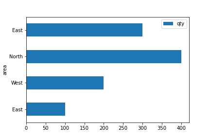
The following code uses Pandas to create dictionary from several lists, then use the dictionary to create a DataFrame and plot the data as an horizontal bar chart.
import pandas as pd

# define lists
candidates = [100,200,400,300]
area = ['East', 'West', 'North', 'East']

# define dictionary
inter_dict = dict(area=area, qty=candidates)

#create DataFrame from dictionary
interviews = pd.DataFrame(inter_dict)

# render graph
interviews.plot(kind='barh', y = 'qty', x='area');
In this case, we’ll create an horizontal bar chart, looking as following:
Charts from csv files
In a similar fashion you can use a predefined csv file to construct a DataFrame and then plot it as a graph. In this last example, we’ll create a scatter chart.
import pandas as pd

# define csv file location
csv_file = 'hr_data.csv'

#create DataFrame from dictionary
interviews = pd.read_csv(csv_file)

interviews.plot(kind='scatter', y = 'num_candidates', x='salary');
Here’s our scatter:

Note: you can create plots also from Excel files. Use the pd.read_excel() method to import your Excel data into a DataFrame and then render your graph as shown in the last section of this post.