An accessible PowerPoint slide master gives authors reusable layouts with real title and content placeholders, readable typography, and strong color contrast. It reduces repair work, but it does not make every presentation accessible automatically. Authors still need meaningful alt text, logical object order, descriptive links, and an Accessibility Checker review.
Create the master in desktop PowerPoint, because PowerPoint for the web cannot create a reusable .potx template. This walkthrough starts with layout structure, then covers fonts, colors, reading order, and a test presentation that exposes weaknesses before the template reaches colleagues.
Start with content patterns
List the slide types your organization actually uses: title, section divider, one-column content, two-column comparison, image with caption, data chart, and closing slide. Build only layouts that have a clear purpose. Too many near-duplicate layouts encourage authors to choose by appearance rather than semantics.
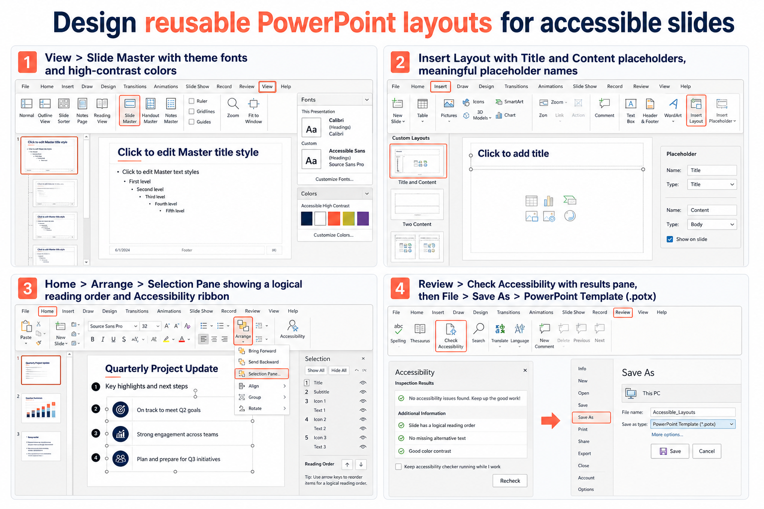
Open a blank presentation, choose View > Slide Master, and select the top master. Set shared theme fonts, background, and recurring elements there. Use the child layouts beneath it for each content pattern.
Use placeholders instead of loose text boxes
On a child layout, choose Slide Master > Insert Placeholder and add a title and the required content placeholders. Placeholders carry structure into new slides and make it easier to reset a damaged layout. Every normal content slide should have a unique title, even when a visual design hides that title from sighted viewers.
Do not simulate a title with a large ordinary text box. Screen-reader and Accessibility Checker behavior is more dependable when the layout contains a title placeholder. If a design needs a hidden title, place it consistently off the visible design area or use PowerPoint’s supported title visibility tools without removing its semantic role.
Set readable theme rules
Choose a sans serif font and a practical default size. Microsoft’s accessible-template guidance recommends fonts at least 18 points and solid backgrounds with contrasting text. Body text often needs more than the minimum in a projected meeting room, so test from the back of a real room when presentations are a major use case.
Set theme colors with sufficient contrast for normal text, large text, icons, and charts. Avoid using color alone to distinguish categories or status. Add labels, shapes, patterns, or direct data labels so the meaning remains when colors are not perceived.
If authors frequently embed outside files or complex objects, the document embedding walkthrough helps identify content that may need an accessible alternative rather than simply placing an object on the slide.
Design for reflow and zoom
Leave enough space in placeholders for larger text and translated strings. Avoid edge-to-edge text and tiny footers. A layout that works only at one exact sentence length will push authors toward shrinking fonts, which defeats the accessible default.
Establish a predictable reading order
Create a sample slide from each layout, then open Home > Arrange > Selection Pane and the Reading Order tools available in your PowerPoint version. Confirm that the title comes first, followed by the main content in a logical sequence. Decorative objects should not interrupt the spoken flow.
Reading order can differ from the visual stacking order, and terminology varies between PowerPoint versions. Test with a screen reader or have an accessibility specialist review representative layouts. The master should reduce ordering work, but authors can still add objects later and change the result.
Keep decorative master objects quiet
Logos, bands, and background ornaments added on the master should not create repeated noise for assistive technology. Prefer a simple design. When an element communicates information, make sure that information also appears in accessible slide content rather than relying on decoration.
Test the layouts as an author would
Close Master View and create a short presentation using every layout. Add realistic titles, paragraphs, images, charts, and tables. Use Home > Reset on selected slides to confirm placeholders return to the intended position and formatting.
Run Review > Check Accessibility. Fix master-level issues first, then determine which warnings require author action. Add alt text to test images, verify table headers, inspect link wording, and check that each slide has a unique title.
For slides that cite research, the source-labeling method can be adapted with descriptive link text and readable reference placement instead of tiny raw URLs.
Also review the presentation in grayscale or with a color-vision simulation, zoom the interface, and export to PDF if that is a normal distribution route. PDF accessibility is a separate output check; a good PowerPoint master does not guarantee a tagged, correctly ordered PDF in every workflow.
Save and distribute the template
Choose File > Save As or Save a Copy, select PowerPoint Template (.potx), and save the file. PowerPoint normally uses the Custom Office Templates folder for personal templates. For organization-wide distribution, use the method approved by your Microsoft 365 administrators rather than emailing uncontrolled copies.
Give the template a version and owner. When you revise a layout, test it again with existing content and assistive technology. Tell authors which accessibility tasks remain theirs, ideally in a short companion guide rather than permanent instructional slides that users forget to delete.
Accessibility questions about slide masters
Does the slide master set alt text for future images?
No. A picture placeholder defines position and formatting, but the author must provide meaningful alt text for each inserted image or mark it decorative when appropriate. The master can remind authors through training, not supply accurate descriptions in advance.
Can I create the template in PowerPoint for the web?
No. Microsoft states that template creation requires a desktop version of PowerPoint. Colleagues can use and edit presentations in the web app, but the reusable master and .potx file should be built and maintained on desktop.
Is white text on a brand color automatically accessible?
No. Contrast depends on the exact foreground and background values and the text size. Test every approved color pairing, including hover-like link colors, chart labels, and small footer text, rather than judging by appearance.
Should every slide use the same reading order?
Every slide should begin with a clear title and follow a logical sequence, but the exact order depends on its content. Define a dependable default for each layout and require authors to review it after adding or rearranging objects.
Treat the master as a guardrail
An accessible slide master makes the correct structure the easiest option: genuine title placeholders, sensible reading order, readable fonts, tested color pairs, and layouts with room for real content. Validate each layout with the Accessibility Checker and representative assistive-technology use before distribution. Then pair the template with concise author responsibilities, because accessibility remains a property of the finished presentation, not merely the file it started from.